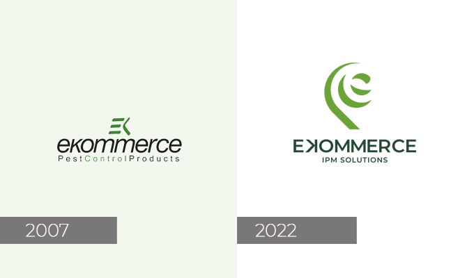
EKOMMERCE CHANGES ITS LOGO AND ITS VISUAL IDENTITY
Ekommerce gives itself a new logo and a new image.
The historic logo left space to the new identity.
What’s the goal? Streghten the identity of the Brand, inextricably linked to the history of Pest Management and its cultural and social changes and project it into the future by bringing at the center, once again, the value, always dear to Ekommerce, of eco-sustainability.
The goal of the rebranding is to represent the renewed company philosophy, to confirm the Ekommerce commitment toward sustainability and streghten its positioning green oriented.
The new logo gets from the past the nuances of green but sees the introduction of a graphic element with a strong symbolic connotation.
The design, in fact, is inspired to the Koru, a spiral shape obtained from the natural profile of the silver fern plant that, in the ancient Maori culture, symbolizes the new life, growth, strenght, renewal.
![]()

 Italiano